In March 2024, our team attended the PDE Data Summit, the tenth anniversary of the Pennsylvania’s state data conference. At the conference, I, Elissa Seto, had the wonderful opportunity to present some of eScholar’s best practices when it comes to visualization. My presentation covered a wide array of visualization topics and vocabulary, and I won’t post the whole presentation here (you’ll have to attend a session for that!). However, I wanted to share one of my favorite best practices that is easy to explain in a blog post: Visual Hierarchy.
Visual Hierarchy is the order in which humans process information on a page. It’s a visual based system to prioritize elements so that they are easily understood. For more on this definition, Canva has great learning piece on this topic.
Here’s a basic example of visual hierarchy, and why it matters. Look at the picture below and see how long it takes to find the number 7.
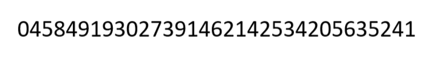
It might have taken a couple of seconds, right? You’re scanning the number across, back and forth, or skipping around until you find the number. One of the challenges here is there is nothing to make the number 7 stand out.
Now look at the new picture below and find the number 7.

It’s a lot easier now, right?
A good visual hierarchy minimizes distractions to important information. To create a visual hierarchy, design your data visualizations with simplicity and what the main point of your data visualization is in mind.
Minimize options for your users, as too many options can distract from your primary goal.
Clearly display important information and overall, keep things simple.
Let’s look at a comparison of a table design:
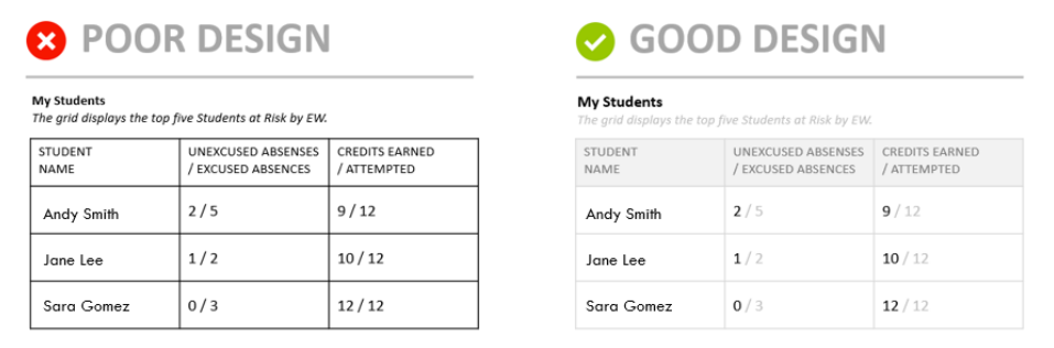
In the left example, we give all the numbers the same status. This leads to the initial digestion of information to appear as if we are evaluating a fraction. On the right, we create a visual hierarchy by lightening the shade of most of the content, while keeping some at the full shade of black. This makes it much easier for a person to quickly see that Andy Smith has 2 unexcused absences while Sara Gomez has 0 unexcused absences.
By implementing a visual hierarchy in your data visualization design, you provide structure and order to be able to process the information you want your users to understand. Visual hierarchy is one of many visualizations best practices that we use across our products. From our data dashboard product, eScholar Advantage, to user interfaces of products such as eScholar Uniq-ID.
How do you want to see visual hierarchy implemented in our products? Comment below!
Connect With Us
"*" indicates required fields